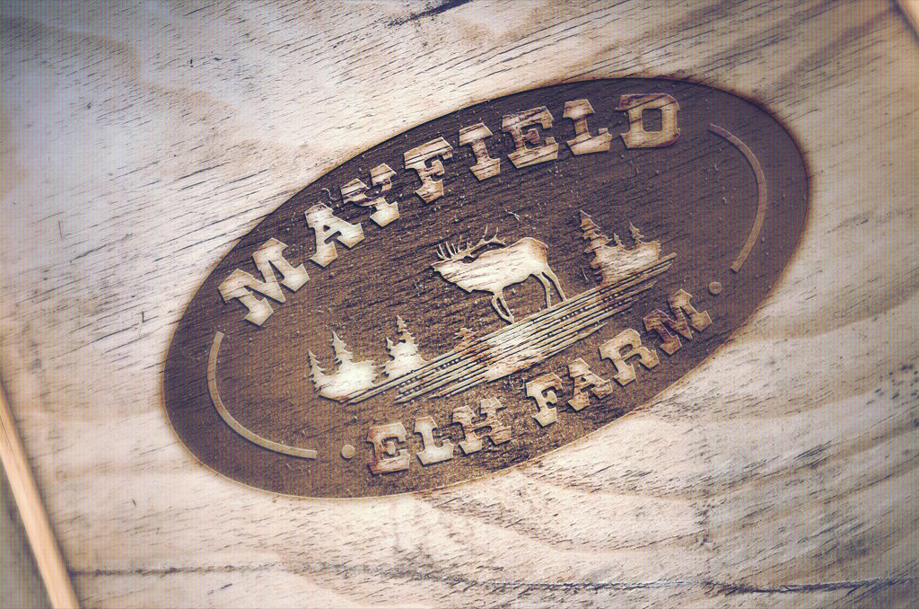
We wanted to share a recent project we worked on for Mayfield Elk. They came to us looking to update their website, and during the process, we ended up evolving their logo to be more compatible in a digital environment.
Their existing logo possessed quite a strong character, or brand personality so we needed to make sure this country, rustic charm wasn’t lost during the evolution of the logo.
The core elements are the same but simplified by establishing this is as a one colour logo – like a stamp on wood. Creating the Elk in a workable format (rather than a flat pixel-based picture) meant we were able to create great supporting graphics across all of the clients marketing material.
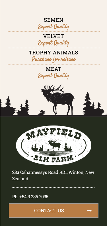
ON THE WEBSITE.
http://www.mayfieldelk.com