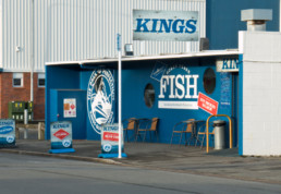
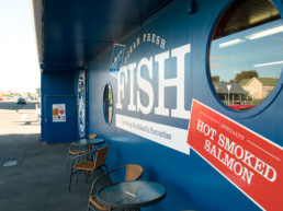
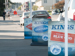
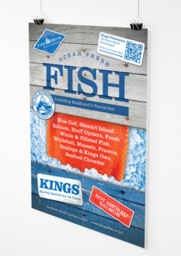
Kings Fishmarket Signage
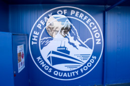
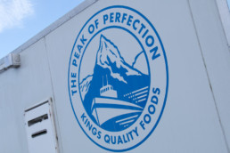
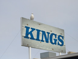
Kings Fishmarket is synonymous with seafood in Southland. A third generation family run business that prides itself on a tradition of providing quality fresh seafood. For a down-to-earth brand identity, we drew inspiration from their scapbook archieve of newspaper cuttings and company memorabilia to create a custom logotype based on weathered vintage timber signage that might be seen emblazoned on the side of fishing boats. As part of the brand we also revamped their ‘Peak of Perfection’ insignia to act as a quality hallmark-style stamp.
When it was time to give the building a bit of a spruce up we took these brand elements and added in a couple of new elements to created a strong fresh look for their Ythan Street fishmarket.
Share